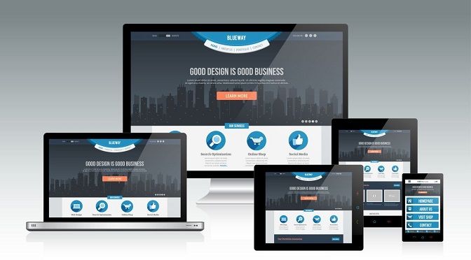
In today’s digital landscape, where users access websites on various devices with different screen sizes, responsive design has become a crucial aspect of web development. Responsive design ensures that websites adapt and provide an optimal viewing experience across multiple devices, including desktops, laptops, tablets, and smartphones. To create visually appealing and user-friendly websites, web developers employ several responsive design techniques.
Fluid Grids
Using relative units like percentages for layout elements, developers create fluid grids that adjust their size and position based on the user’s screen resolution. This allows the content to scale seamlessly across devices.
Flexible Images
By setting maximum widths and using CSS techniques like max-width and object-fit, developers ensure that images resize and adapt to different screen sizes without losing their aspect ratio or becoming pixelated.
Media Queries
Media queries enable developers to apply different CSS styles based on specific device characteristics, such as screen width, orientation, or pixel density. This allows for customized layouts and styles for different devices.

Breakpoints
Breakpoints define specific screen widths at which the layout or design of a website changes. By strategically placing breakpoints, developers can optimize the design for different device sizes, ensuring that content remains readable and accessible.
Mobile-First Approach
Adopting a mobile-first approach involves designing for mobile devices first, then progressively enhancing the design for larger screens. This ensures a strong focus on essential content and a seamless experience on mobile devices.
Flexible Typography
Using responsive typography techniques, such as fluid type scaling, relative font sizes, and line height adjustments, developers ensure that text is legible and accessible on all devices.

Retina-Ready Graphics
Retina displays have high pixel density, requiring higher resolution graphics. Developers use techniques like CSS media queries and high-resolution image assets to deliver crisp and clear visuals on devices with retina displays.
Performance Optimization
To improve page loading times and overall performance, developers employ techniques like lazy loading images, minification of CSS and JavaScript, and optimizing server response times. This ensures a smooth browsing experience on all devices, including slower connections.
Cross-Browser Compatibility
Web developers test and optimize websites to ensure they work well across different web browsers, including Chrome, Firefox, Safari, and Edge. This ensures consistent functionality and appearance across various platforms.

Testing and Iteration
Regular testing on different devices and screen sizes is essential to identify and fix any issues or inconsistencies. User feedback and analytics data provide insights for further refinements and improvements.
In conclusion, responsive design techniques are fundamental in creative web development. By employing fluid grids, flexible images, media queries, breakpoints, and other strategies, web developers can create visually stunning and user-friendly websites that seamlessly adapt to various devices. This enhances the user experience, improves accessibility, and maximizes engagement across different platforms.
Key Points Summary
- Responsive design is essential for ensuring optimal user experience across different devices in web development.
- Fluid grids and flexible images allow the layout and visuals to adapt to different screen sizes.
- Media queries and breakpoints enable the application of customized styles based on device characteristics.
- Adopting a mobile-first approach ensures a strong focus on essential content and a seamless experience on mobile devices.
- Flexible typography and retina-ready graphics enhance readability and visual quality on various screens.
- Performance optimization techniques, such as lazy loading and minification, improve page loading times.
- Cross-browser compatibility ensures consistent functionality across different web browsers.
- Regular testing and iteration are necessary to identify and address any issues or inconsistencies.
- The goal is to create visually stunning and user-friendly websites that adapt to different devices, enhancing the overall user experience and engagement.
Contact our Vietnam team to learn more about how we can help you optimize your website for SEO and achieve your online marketing goals.