
In today’s digital landscape, cross-browser compatibility is crucial for ensuring that websites function and appear consistently across different browsers and devices. Responsive design, which aims to provide optimal user experiences on all screen sizes, requires careful consideration of cross-browser compatibility. In this article, we will explore the best practices for achieving cross-browser compatibility in responsive design.
Test on Multiple Browsers
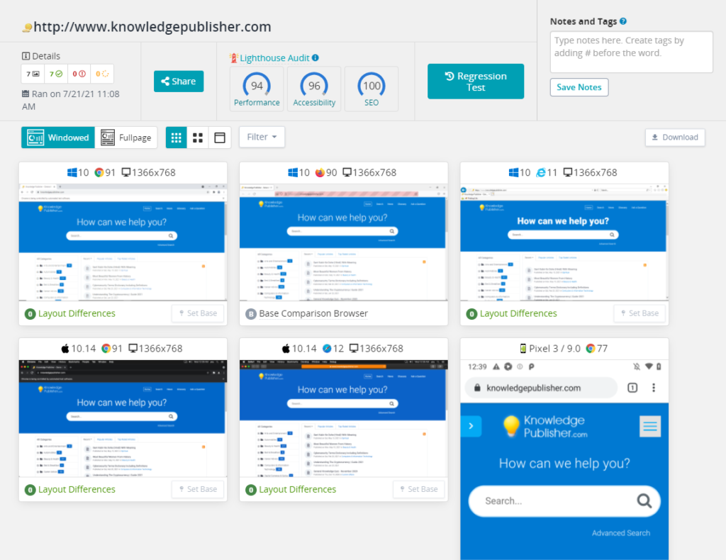
To ensure cross-browser compatibility, it is essential to test your responsive website on multiple browsers and versions. This includes popular browsers such as Chrome, Firefox, Safari, and Edge, as well as older versions that may still be in use. Testing will help identify any inconsistencies or issues that need to be addressed.

Use Standardized Web Technologies
Adhering to standardized web technologies, such as HTML5, CSS3, and JavaScript, promotes cross-browser compatibility. Avoid using browser-specific or vendor-prefixed features that may not be supported across all browsers. Use feature detection techniques to provide fallback options or alternative solutions for unsupported features.
Implement a Mobile-First Approach
Starting the design process with a mobile-first approach ensures that the website’s core functionality and design are optimized for smaller screens. This approach helps prioritize content and streamline the user experience. As the design expands to larger screens, media queries and responsive techniques can be used to adapt the layout accordingly.
Responsive Typography
Ensure that typography elements, such as font sizes, line heights, and font families, adapt seamlessly across different browsers and devices. Use relative units like percentages, ems, or rems to ensure consistent scaling. Avoid relying on specific pixel values that may not render consistently across devices.
Flexible Layouts with CSS Grid and Flexbox
CSS Grid and Flexbox are powerful layout tools that provide flexible and responsive grid-based and flexible box layouts. These technologies simplify the creation of complex and adaptive layouts. However, it is important to test and validate the layouts on different browsers to ensure consistent rendering.

Optimize Media Assets
Optimize images, videos, and other media assets to improve loading times and minimize bandwidth usage. Use modern image formats like WebP or JPEG 2000, and compress images to reduce file size without sacrificing quality. Implement lazy loading techniques to load media assets only when they are needed.
Browser-Specific CSS
In some cases, certain browsers may require specific CSS rules or workarounds to ensure proper rendering. Use CSS hacks or vendor prefixes sparingly and only when necessary. Instead, consider using feature detection and progressive enhancement to provide alternative styles or functionality based on browser capabilities.
Regularly Update and Maintain
Keep your website’s codebase and dependencies up to date to ensure compatibility with the latest browser versions. Browser vendors frequently release updates and bug fixes, and staying current will help address any compatibility issues that arise.
In conclusion, achieving cross-browser compatibility is essential for a successful responsive design. By following these best practices, you can ensure that your website provides a consistent and optimal user experience across different browsers and devices. Regular testing, adherence to standardized technologies, and thoughtful implementation of responsive techniques will help you create a website that performs seamlessly across the digital landscape.
Key Points Summary
- Testing the responsive website on multiple browsers and versions is crucial for identifying and addressing any compatibility issues.
- Adhering to standardized web technologies promotes cross-browser compatibility, while avoiding browser-specific or vendor-prefixed features.
- A mobile-first approach helps prioritize content and streamline the user experience, with media queries used to adapt the layout for larger screens.
- Implementing responsive typography ensures consistent scaling across browsers and devices.
- CSS Grid and Flexbox are powerful tools for creating flexible and responsive layouts, but they should be tested on different browsers.
- Optimize media assets to improve loading times and minimize bandwidth usage.
- Browser-specific CSS rules or workarounds may be necessary in some cases, but they should be used sparingly and as a last resort.
- Regularly update and maintain the website’s codebase and dependencies to ensure compatibility with the latest browser versions.
Contact our Vietnam team to learn more about how we can help you optimize your website for SEO and achieve your online marketing goals.


