
In today’s digital landscape, users access websites and applications through a myriad of devices, from desktop computers to smartphones and tablets. The challenge lies in delivering a seamless and consistent user experience across multiple platforms. This article delves into the concept of multi-platform design and highlights the essential strategies to create a unified and enjoyable user experience across various devices.
Embracing Responsive Design:
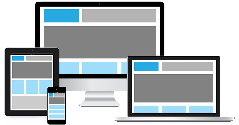
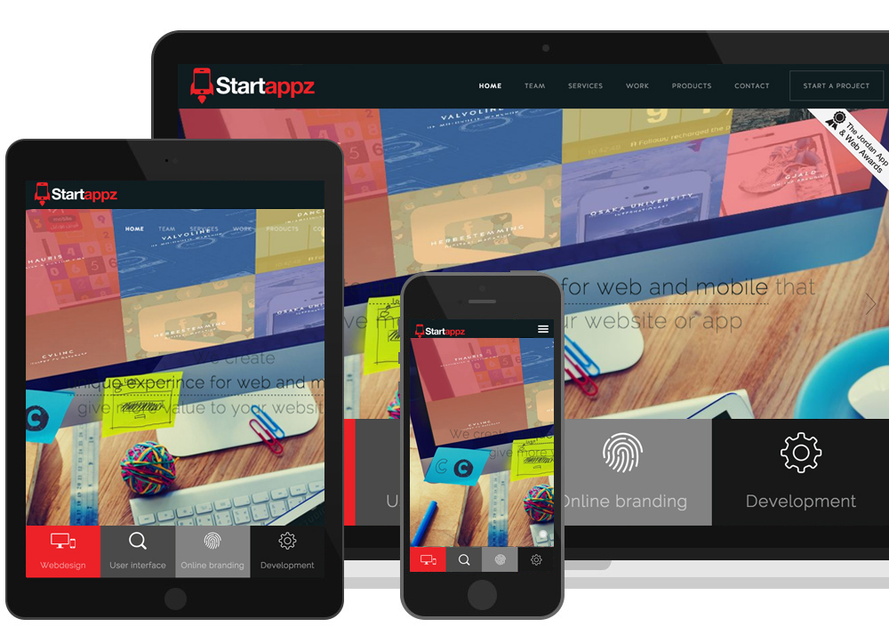
Responsive design is the cornerstone of multi-platform design. By implementing responsive techniques, websites and applications automatically adapt their layout, content, and elements to fit the screen size and resolution of the device being used. This ensures that users can access and navigate your platform effortlessly, whether they are on a desktop, tablet, or smartphone.
Cross-Platform Compatibility:
Achieving cross-platform compatibility is essential for reaching a broader audience. Ensuring that your design functions optimally on different operating systems (e.g., iOS, Android, Windows) and web browsers guarantees a consistent user experience for all users, regardless of their chosen platform.
Mobile-First Approach:
Adopting a mobile-first approach involves designing the user experience primarily for mobile devices before scaling up to larger screens. Given the prevalence of mobile usage, this strategy ensures that essential elements are prioritized and presented effectively on smaller screens, leading to improved engagement and user satisfaction.
Consistency in Design Elements:
Consistency is a key principle in multi-platform design. Maintain uniformity in design elements, such as color schemes, typography, and navigation, across all platforms. Consistent design instills a sense of familiarity and helps users easily transition between different devices without feeling disoriented.
User-Centric Design:
Center your design decisions around the needs and preferences of your target audience. Conduct user research and gather feedback to understand how users interact with your platform on various devices. By aligning design choices with user expectations, you create an intuitive and user-friendly experience.
Adaptive Layouts:
Consider using adaptive layouts in conjunction with responsive design to fine-tune the user experience. Adaptive layouts cater to specific devices or screen sizes, allowing you to optimize the presentation of content and functionality based on the device’s capabilities.
Performance Optimization:
Efficient performance is crucial for multi-platform design. Optimize your platform’s loading times and minimize the use of heavy assets to ensure a smooth and enjoyable user experience, regardless of the device’s processing power or internet connection.
In conclusion, in an era where users interact with digital platforms across various devices, creating a seamless user experience with multi-platform design is essential for success. By embracing responsive design, ensuring cross-platform compatibility, adopting a mobile-first approach, maintaining consistency, prioritizing user-centric design, utilizing adaptive layouts, and optimizing performance, you can deliver a unified and delightful experience for your audience. Remember, the key to success lies in putting the user at the center of your design process and providing a seamless experience that transcends device boundaries. With multi-platform design, you can effectively engage users and foster loyalty, driving your platform to new heights of success.

Key Points Summary
- Responsive design adapts the layout to different screen sizes and resolutions.
- Cross-platform compatibility ensures a consistent experience across operating systems and browsers.
- The mobile-first approach prioritizes design for smaller screens and mobile devices.
- Consistency in design elements creates familiarity for users across platforms.
- User-centric design focuses on meeting user needs and preferences.
- Adaptive layouts fine-tune the experience for specific devices or screen sizes.
- Performance optimization enhances the speed and efficiency of the platform.
Contact our Vietnam team to learn more about how we can help you optimize your website for SEO and achieve your online marketing goals.


