In today’s digital landscape, users interact with websites and applications across a variety of platforms, including desktops, smartphones, tablets, and smart TVs. To deliver a seamless and consistent user experience, businesses need to adopt a multi-platform design strategy. This approach ensures that their digital presence remains cohesive and optimized across different devices and platforms. Here are the key elements of a successful multi-platform design strategy:
Responsive Design
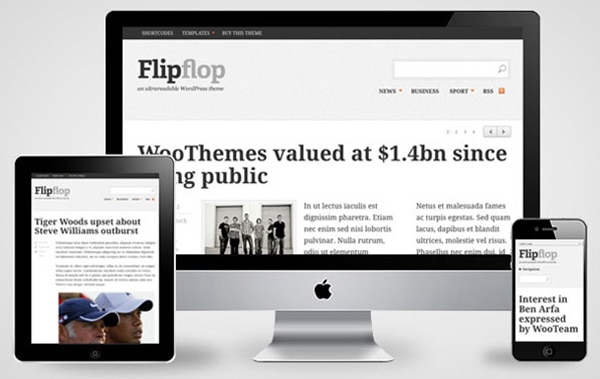
Responsive design is the foundation of a multi-platform strategy. It involves designing and developing websites and applications that automatically adjust and adapt their layout, content, and functionality based on the screen size and resolution of the device being used. This ensures that the user experience remains consistent and optimized across all platforms.

Consistent Branding
Consistency in branding is crucial for establishing a strong and recognizable brand identity. The design elements, such as colors, typography, and visual style, should be consistent across all platforms to create a unified and cohesive brand experience. This helps in building brand recognition and trust among users.
User-Centric Approach
A successful multi-platform design strategy puts the user at the center. It involves understanding the needs, preferences, and behaviors of the target audience on different platforms and tailoring the design accordingly. User research, usability testing, and user feedback play a vital role in shaping the design decisions.
Cross-Platform Compatibility
Cross-platform compatibility ensures that the design and functionality of the website or application work seamlessly across different devices and operating systems. It involves thorough testing and optimization to address any platform-specific issues and provide a consistent experience to all users.
Adaptive Content
Adaptive content is an essential element of a multi-platform design strategy. It involves creating content that can be easily repurposed and presented in different formats and layouts across various devices and platforms. This allows users to access and engage with the content in a way that is most convenient and relevant to them.

Performance Optimization
With users accessing websites and applications on various devices and network conditions, performance optimization is crucial. It involves optimizing assets, such as images and videos, and implementing techniques like caching and minification to ensure fast loading times and smooth interactions across platforms.
Scalability and Flexibility
A successful multi-platform design strategy anticipates future growth and technological advancements. It involves designing systems that can easily scale and adapt to new platforms, devices, and user expectations. This future-proof approach ensures that the design remains relevant and effective over time.
In conclusion, a successful multi-platform design strategy encompasses responsive design, consistent branding, a user-centric approach, cross-platform compatibility, adaptive content, performance optimization, and scalability. By considering these key elements, businesses can create a seamless and engaging user experience across all platforms, resulting in increased user satisfaction, better brand perception, and improved business outcomes.

Key Points Summary
- Responsive design is essential for a successful multi-platform design strategy, as it ensures that websites and applications adapt to different screen sizes and resolutions.
- Consistent branding across all platforms helps establish a strong and recognizable brand identity.
- User-centric approach involves understanding user needs and preferences on different platforms and tailoring the design accordingly.
- Cross-platform compatibility ensures that the design and functionality work seamlessly across devices and operating systems.
- Adaptive content allows for repurposing and presenting content in different formats and layouts across platforms.
- Performance optimization is crucial for fast loading times and smooth interactions across all platforms.
- Scalability and flexibility are important considerations to future-proof the design and accommodate new platforms and devices.
Contact our Vietnam team to learn more about how we can help you optimize your website for SEO and achieve your online marketing goals.