Responsive web design has become a standard practice in the digital landscape, ensuring optimal user experience across different devices. To streamline the development process, designers and developers can rely on responsive design frameworks and tools. These frameworks and tools provide a foundation for building responsive websites efficiently and effectively. In this article, we will explore some popular responsive design frameworks and tools that can aid in creating responsive websites.
Bootstrap
Bootstrap is one of the most widely used responsive design frameworks. It offers a comprehensive set of CSS and JavaScript components that make it easy to create responsive layouts, navigation menus, forms, and more. Bootstrap’s grid system allows for flexible and responsive grid layouts that adapt to different screen sizes.
Foundation
Foundation is another popular responsive design framework that provides a collection of CSS and JavaScript components. It offers a responsive grid system, interactive elements, and pre-styled components for building responsive websites. Foundation also includes a responsive navigation menu and form validation features.
CSS Grid
CSS Grid is a native CSS feature that allows for the creation of responsive grid layouts. It provides a powerful layout system with precise control over the placement and sizing of elements. CSS Grid simplifies the process of creating responsive designs without relying on external frameworks.
Flexbox
Flexbox is another CSS feature that enables flexible and responsive layouts. It provides a one-dimensional layout model that allows for dynamic alignment and distribution of elements. Flexbox is particularly useful for creating responsive designs with flexible content containers and vertically aligning items.

Sass and Less
Sass (Syntactically Awesome Style Sheets) and Less (Leaner Style Sheets) are CSS preprocessors that extend the capabilities of CSS. They offer features like variables, mixins, and functions, which make it easier to write and manage CSS code. These preprocessors can greatly enhance the efficiency and maintainability of responsive web design projects.
Device Testing Tools
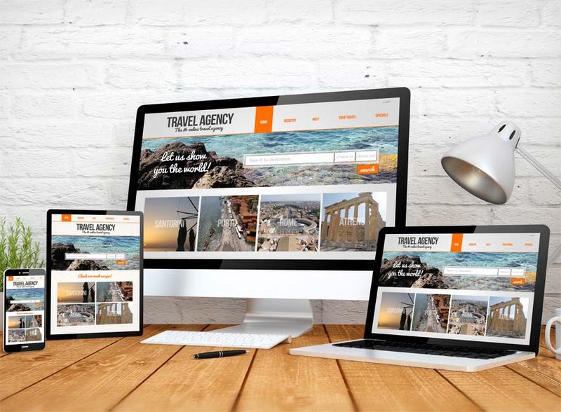
To ensure the responsiveness of a website, it is important to test it on various devices and screen sizes. There are several tools available that simulate different devices, such as browser developer tools and online responsive design testing platforms. These tools allow designers and developers to preview and test their responsive designs across multiple devices without the need for physical devices.
In conclusion, responsive design frameworks and tools are invaluable resources for designers and developers working on responsive web design projects. They provide a range of pre-built components, layout systems, and testing capabilities that simplify and accelerate the creation of responsive websites. Whether using frameworks like Bootstrap and Foundation, leveraging native CSS features like CSS Grid and Flexbox, or utilizing preprocessors like Sass and Less, these tools can help achieve seamless and efficient responsive web design. By incorporating responsive design frameworks and tools into your workflow, you can create engaging and user-friendly experiences across devices.

Key Points Summary
- Responsive design frameworks and tools simplify the development of responsive websites by providing pre-built components, layout systems, and testing capabilities.
- Popular responsive design frameworks include Bootstrap and Foundation, offering a wide range of CSS and JavaScript components for responsive layouts, navigation menus, and forms.
- Native CSS features like CSS Grid and Flexbox allow for flexible and responsive grid layouts and dynamic alignment of elements.
- CSS preprocessors like Sass and Less extend the capabilities of CSS, offering features such as variables and mixins that enhance code efficiency and maintainability.
- Device testing tools, such as browser developer tools and online responsive design testing platforms, enable designers and developers to preview and test responsive designs across multiple devices.
- Incorporating responsive design frameworks and tools into the workflow helps create engaging and user-friendly experiences on different devices.
Contact our Vietnam team to learn more about how we can help you optimize your website for SEO and achieve your online marketing goals.