In today’s mobile-driven world, designing responsive forms and input fields is crucial for creating a seamless user experience across devices. Whether it’s a contact form, login form, or search bar, optimizing these elements for different screen sizes and input methods can greatly enhance usability and increase conversions. Here are some strategies to consider when designing responsive forms and input fields:
Simplify the Form
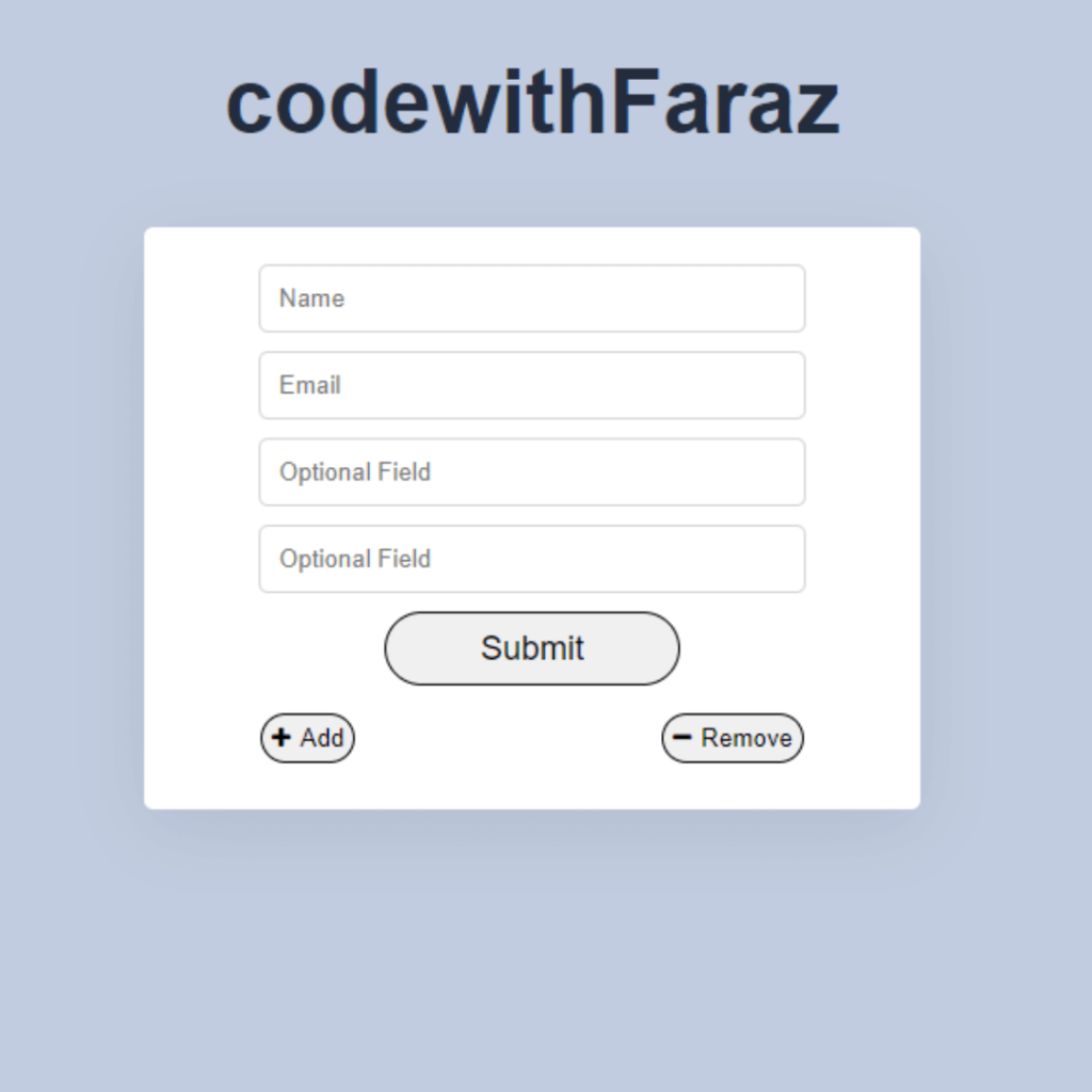
Keep the form fields to a minimum and only ask for essential information. Long forms can be overwhelming on smaller screens and may discourage users from completing them.
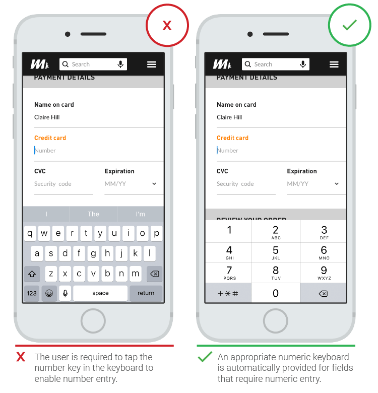
Use Mobile-Friendly Input Types
Utilize HTML5 input types such as “email,” “tel,” and “number” to trigger mobile-friendly keyboards and provide a better user experience. This ensures that users are presented with the most relevant keyboard layout for the input field.
Adaptive Placeholder Text
Implement adaptive placeholder text that adjusts based on the input field’s context or user interaction. This helps conserve screen real estate while still providing guidance to users.
Optimize Button Placement
Place form submission buttons within easy reach of the user’s thumb on mobile devices. Consider placing the button at the bottom of the screen or using sticky/floating buttons for easy access.
Implement Inline Validation
Provide real-time validation feedback as users fill out the form. Displaying inline error messages or validation indicators next to each input field helps users correct mistakes instantly and prevents form submission errors.

Responsive Error Handling
Design error messages to be clear and prominent, ensuring they are visible even on smaller screens. Use concise language and visually distinguishable error indicators to help users quickly identify and resolve any issues.
Consider Autocomplete and Autofill
Leverage browser autocomplete and autofill features to streamline the form-filling process. This saves users time and minimizes input errors.
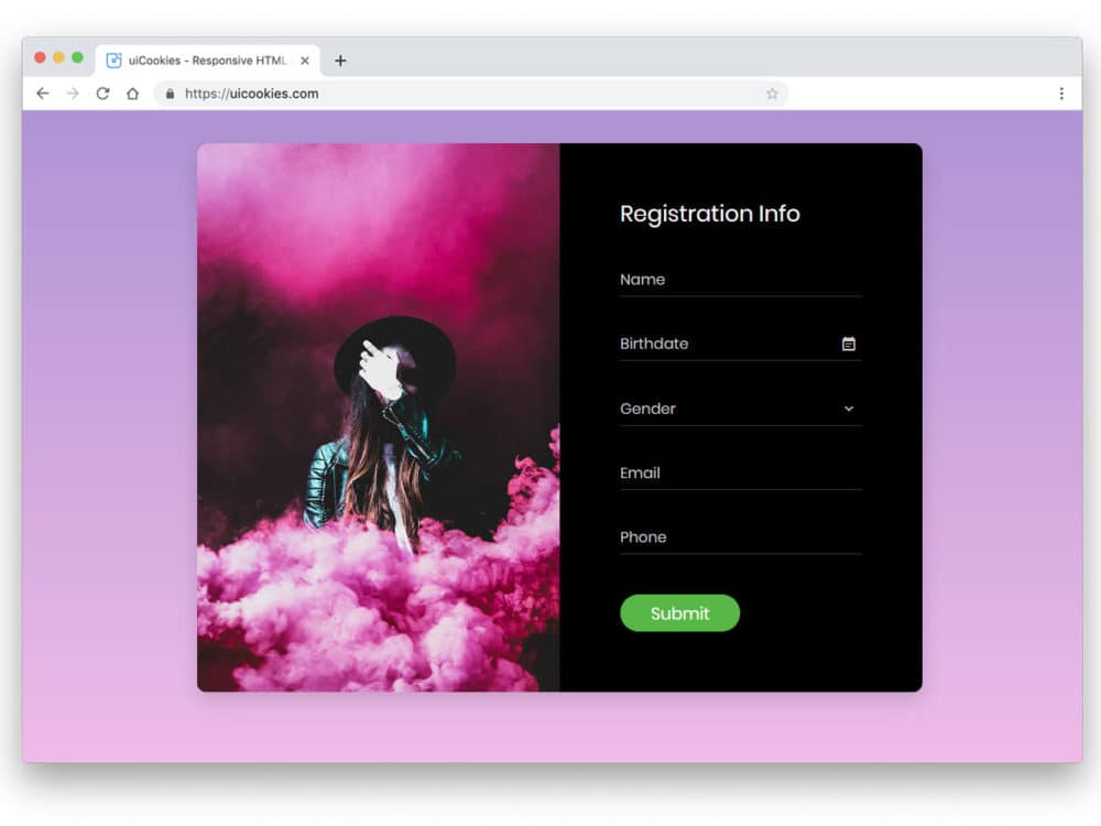
Responsive Layouts
Design forms with flexible layouts that adapt to different screen sizes. Consider using a single-column layout for smaller screens and multi-column layouts for larger screens to optimize space and readability.
Touch-Friendly Input Sizes
Increase the size of form fields and buttons to accommodate touch interactions on mobile devices. This reduces the chances of misclicks or input errors and improves the overall user experience.
Test and Iterate
Regularly test your responsive forms and input fields on various devices and screen sizes. Collect user feedback and data to identify any pain points or areas for improvement. Continuously iterate and refine your designs to ensure optimal performance.
In conclusion, by implementing these strategies, you can create responsive forms and input fields that provide a seamless and user-friendly experience across devices. Prioritize simplicity, adaptability, and optimization to enhance user engagement and conversions on your website or application.
Key Points Summary
- Simplify the form by keeping the fields to a minimum and only asking for essential information.
- Use mobile-friendly input types to trigger relevant keyboard layouts for improved user experience.
- Implement adaptive placeholder text that adjusts based on the input field’s context or user interaction.
- Optimize button placement for easy access on mobile devices, considering bottom placement or sticky/floating buttons.
- Provide real-time inline validation feedback to help users correct mistakes instantly.
- Design clear and prominent error messages that are visible on smaller screens.
- Leverage browser autocomplete and autofill features to streamline the form-filling process.
- Design responsive layouts that adapt to different screen sizes, considering single-column and multi-column layouts.
- Increase the size of form fields and buttons for touch-friendly interactions on mobile devices.
- Regularly test and iterate on your responsive forms and input fields to optimize performance and user experience.
Contact our Vietnam team to learn more about how we can help you optimize your website for SEO and achieve your online marketing goals.