In today’s digital landscape, where users access websites and apps on a wide range of devices, responsive design has become essential. A significant aspect of responsive design is the effective handling of images and media. By employing various techniques, web designers can ensure that images and media elements adapt seamlessly to different screen sizes and resolutions, providing an optimal user experience.
Image Optimization
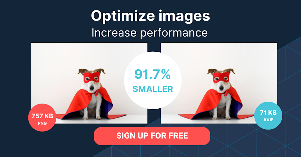
Optimizing images for the web is crucial to minimize file size without compromising quality. Techniques such as image compression and lazy loading help reduce load times and improve performance.

Scalable Vector Graphics (SVG)
SVGs are resolution-independent and can be scaled without loss of quality. Using SVGs for logos, icons, and illustrations ensures they look sharp on any screen.
Flexible Images
CSS techniques like max-width: 100% and height: auto allow images to scale fluidly within their containers. This ensures that images adapt to different screen sizes and maintain their aspect ratios.
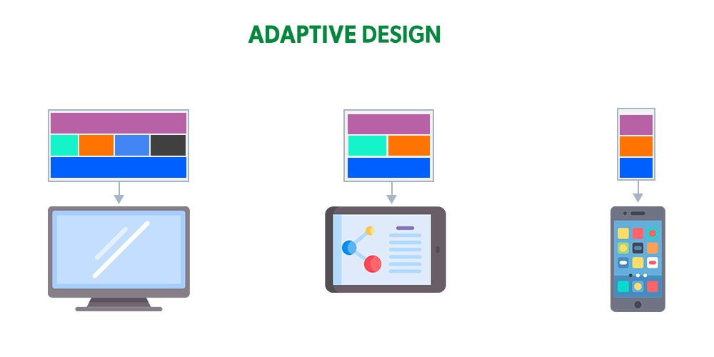
Media Queries
Media queries allow designers to apply different styles based on screen sizes. By specifying breakpoints and targeting specific devices, media queries enable custom layouts and adaptivity for images and media.
Responsive Videos
Implementing techniques like fluid-width video containers and HTML5 video elements with multiple source files allows videos to adjust to different screen sizes. Additionally, using video formats that are supported across devices ensures broad compatibility.

Retina Display Optimization
Retina displays have high pixel densities, requiring higher-resolution images. Using CSS media queries and serving higher-resolution images to devices with retina displays ensures crisp and clear visuals.
Art Direction
Art direction techniques involve serving different images based on the device or screen size. This allows designers to tailor the visuals to each context and optimize the user experience.
Adaptive Loading
Adaptive loading techniques involve loading different image versions or resolutions based on network conditions or device capabilities. This helps balance performance and visual quality, especially in scenarios with limited bandwidth.
Picture Element and Srcset Attribute
The picture element and srcset attribute provide a way to specify multiple image sources and sizes. This enables the browser to choose the most appropriate image based on device capabilities and viewport size.
In conclusion, by implementing these techniques, web designers can ensure that images and media elements on their websites adapt seamlessly to different devices, screen sizes, and resolutions. This enhances the user experience, improves performance, and makes the website more accessible to a wide range of users.

Key Points Summary
- Image optimization techniques, such as compression and lazy loading, help reduce file size and improve website performance.
- Scalable Vector Graphics (SVG) ensure high-quality images that can be scaled without losing resolution.
- Flexible images that use CSS properties like max-width: 100% and height: auto adapt to different screen sizes while maintaining their aspect ratios.
- Media queries allow designers to apply different styles and layouts based on screen sizes, enabling customized image and media handling.
- Responsive videos can be achieved through fluid-width video containers and HTML5 video elements with multiple source files.
- Retina display optimization involves serving higher-resolution images to devices with high pixel density displays.
- Art direction techniques allow for the customization of images based on device or screen size, optimizing the visual experience.
- Adaptive loading techniques adjust image loading based on network conditions or device capabilities.
- The picture element and srcset attribute enable the browser to choose the most appropriate image source based on device capabilities and viewport size.
Contact our Vietnam team to learn more about how we can help you optimize your website for SEO and achieve your online marketing goals.