
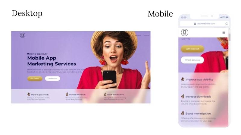
In today’s digital landscape, where users access websites on various devices, user-centric design has become paramount. User-centric design focuses on creating a seamless and enjoyable user experience across different screen sizes and devices. One of the key approaches to achieving this is through responsive web design, which adapts the layout and content of a website based on the user’s device.
Understanding User Behavior
To design a user-centric website, it is crucial to understand the behavior and preferences of the target audience. Conduct user research, analyze user data, and gather insights to inform design decisions.
Mobile-First Approach
With the majority of users accessing websites on mobile devices, adopting a mobile-first approach ensures that the design prioritizes the mobile experience. Start by designing for mobile devices and progressively enhance the design for larger screens.
Clear and Intuitive Navigation
Users should be able to navigate through the website effortlessly. Use clear and concise navigation menus, intuitive icons, and logical page hierarchy to help users find what they are looking for quickly.
Content Prioritization
Prioritize the most important content and features for mobile devices to ensure a seamless user experience. Use progressive disclosure techniques to reveal additional content as needed.
Responsive Typography
Typography plays a vital role in readability and user engagement. Choose font sizes, line heights, and spacing that are comfortable to read on various screen sizes. Use responsive typography techniques, such as fluid typography and modular scale, to ensure readability across devices.

Optimized Images and Media
Optimize images and media files to reduce load times and improve performance. Use responsive image techniques, such as lazy loading and adaptive images, to deliver the right image size for each device.
Touch-Friendly Interactions
With the rise of touch-enabled devices, design for touch interactions by incorporating larger buttons, swipe gestures, and intuitive touch-based controls. Ensure that interactive elements are easily accessible and responsive to touch inputs.
Performance Optimization
Users expect fast-loading websites, regardless of the device they are using. Optimize website performance by minimizing file sizes, leveraging caching techniques, and optimizing code to ensure smooth and efficient browsing experiences.
Accessibility Considerations
Design with accessibility in mind to ensure that all users, including those with disabilities, can access and navigate the website. Incorporate accessible design principles, such as proper color contrast, text alternatives for images, and keyboard navigation support.
Continuous Testing and Iteration
Regularly test the website across different devices and screen sizes to identify and fix any usability issues. Gather feedback from users and make iterative improvements to enhance the user experience over time.
In conclusion, by prioritizing the needs and preferences of users, user-centric design in responsive web design ensures that websites deliver a consistent and engaging experience across devices. Incorporating these principles and best practices into the design process will lead to increased user satisfaction, improved engagement, and ultimately, better business results.

Key Points Summary
- User-centric design in responsive web design puts the needs and preferences of users at the forefront.
- Adopting a mobile-first approach ensures that the design prioritizes the mobile user experience.
- Clear and intuitive navigation helps users easily find what they’re looking for on the website.
- Content prioritization ensures that the most important content and features are accessible on mobile devices.
- Responsive typography techniques ensure readability and legibility across different screen sizes.
- Optimizing images and media files improves website performance and load times.
- Designing touch-friendly interactions enhances the user experience on touch-enabled devices.
- Performance optimization techniques, such as file size reduction and caching, ensure fast-loading websites.
- Considering accessibility principles ensures that all users can access and navigate the website.
- Continuous testing and iteration help identify and resolve usability issues for an improved user experience.
Contact our Vietnam team to learn more about how we can help you optimize your website for SEO and achieve your online marketing goals.


